Capturing the Spirit of the North Through Thoughtful Design
At Traverse City Web Design, we believe that visual design is more than aesthetics—it’s a sense of place. A good website or graphic should feel anchored, like it belongs not just to a brand, but to the landscape, the culture, and the rhythm of its surroundings.
Here in Northern Michigan, we’re surrounded by natural beauty that inspires the work we create every day.
From the tranquil rise and fall of Lake Michigan’s waves to the deep hush of pine forests in winter, our environment offers a rich visual language. The region’s colors aren’t loud or showy—they’re subtle, complex, and evocative. When we craft a design, we draw directly from this palette of sky, stone, water, wood, and wildflower, using color to convey stories that feel local, trustworthy, and timeless.
Northern-inspired palettes help us bring that sense of familiarity and wonder into every design—whether we’re working with a lakeside bed-and-breakfast, a boutique food brand, or an outdoor adventure company. These palettes are more than pretty—they’re powerful. They mimic, complement, and accentuate the spirit of the north in ways that connect with audiences on an emotional level.
In this article, we’ll walk you through how we build northern color palettes, and we’ll be sharing several examples we’ve created and implemented across our web and graphic design projects. These real-world applications showcase how thoughtful color choices can reflect identity, set tone, and leave a lasting impression.

Why Use Northern-Inspired Palettes?
When we design with a northern palette, we’re aiming for a visual experience that’s calm, grounded, and memorable. These palettes feel honest and organic, creating an emotional connection that transcends screen or print. They reflect the land and light that locals know intimately, and they invite outsiders to discover something quietly extraordinary.
In a digital world crowded with generic templates and trendy design fads, using a regionally inspired palette is a powerful way to stand out. It builds trust by signaling authenticity, sustainability, and a sense of place. Whether you’re a brand deeply rooted in the community or one that simply shares the values of the northern lifestyle, a well-curated color scheme can visually communicate that alignment.
Our Approach to Northern Color Palettes
When we set out to create a palette, we don’t start with a color wheel—we start with the seasons, the textures of bark and dune grass, the crispness of autumn air, or the softness of summer light. The palette isn’t just visual—it’s sensory. Here’s how we break down the core colors that shape our northern-inspired approach:
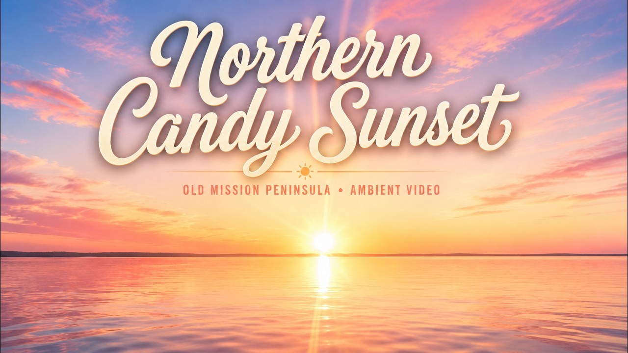
Blues and Grays – Sky, Water, and Weather
The Great Lakes are the soul of Northern Michigan, and their shifting moods give us endless shades to work with. In spring, the water is pale and glassy, kissed with light steel blues and silver fog. By summer, deeper tones emerge—cerulean on sunny days, and a bruised slate blue under a passing storm.
Gray tones bring balance and quiet strength. They remind us of overcast skies, wet rocks, or early morning mist hanging over the bay. These hues create serene backdrops, offer contrast without harshness, and ground a design in a way that feels thoughtful and contemporary.
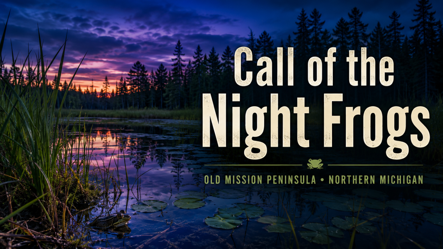
Greens – Forests, Pines, and New Growth
Northern Michigan is cloaked in green for much of the year—layers upon layers of leaf, moss, and pine. These shades speak of life, growth, and enduring presence. In spring, there’s a delicate brightness to the foliage—soft sages and minty greens that suggest freshness and renewal.
As the seasons deepen, so do the greens. The pine trees bring richness and depth, anchoring a design with a feeling of longevity and strength. These darker tones can feel elegant and earthy at once, making them ideal for projects that want to evoke calm, connection, and sustainability.
Browns – Tree Bark, Sand, and Earth
Brown may seem humble, but in the north, it’s a color of resilience and foundation. From the twisting trunks of old-growth trees to the wind-swept dunes and forest trails, brown tones give a design a grounded, tactile quality. We use warm tans and golden beiges to suggest softness, like weathered sand or aged paper.
Deeper browns—like umber, chestnut, and espresso—add contrast and warmth. They pair beautifully with brighter accents or cooler tones, providing a sense of balance. These shades are especially powerful in branding for hospitality, woodworking, farming, or anything that celebrates the craft and labor of the land.
Yellows – Sunlight, Dunes, and Golden Hour
Sunlight in Northern Michigan doesn’t just shine—it glows. It filters through the trees at golden hour, dances off the dunes, and reflects in quiet ripples on the lake. Our yellow hues draw directly from this light—never too sharp or neon, but soft, warm, and optimistic.
Goldenrod, pale honey, and mellow wheat tones bring a sunny energy to any design, without overpowering the rest of the palette. These yellows are used as highlights and accents, calling attention to key features while keeping the overall feeling harmonious and inviting.
Pinks and Purples – Wildflowers, Twilight, and Bloom
Come spring and summer, Northern Michigan explodes into subtle color. The fields and trails bloom with wildflowers—lupine, thistle, petunia, phlox—and the sky at dusk takes on lavender, rose, and berry hues. These colors add emotional texture to our palettes: soft, romantic, and sometimes a little wild.
Dusty rose and blush pinks bring warmth and tenderness, while purples—from muted lilac to rich plum—can convey calm, mystery, or even luxury. These tones often act as supporting characters in a design, adding unexpected beauty that delights the viewer without demanding center stage.
Some of Our Favorite Palettes from Projects


Conclusion
Northern Michigan is not just a place—it’s a feeling. It’s the quiet of the woods, the stretch of a lake horizon, the wild bloom of summer, and the golden hush of evening. When we design with these colors, we’re not just creating visuals—we’re capturing a story, a season, a sense of belonging.
For clients in the region or those who want to align themselves with northern values—tranquility, craftsmanship, natural beauty—these palettes offer a subtle but powerful language. They help brands say, “We see the world a little differently. We move a little slower. We care about the details.”
As designers, our goal is always to make work that resonates—and Northern color palettes help us do just that. They’re timeless, elegant, and infinitely adaptable. In the next section, we’ll be sharing 18 of our favorite palettes pulled directly from real projects. Whether you’re planning a rebrand or just looking for inspiration, we hope they help you see Northern Michigan the way we do: beautifully, and in full color.