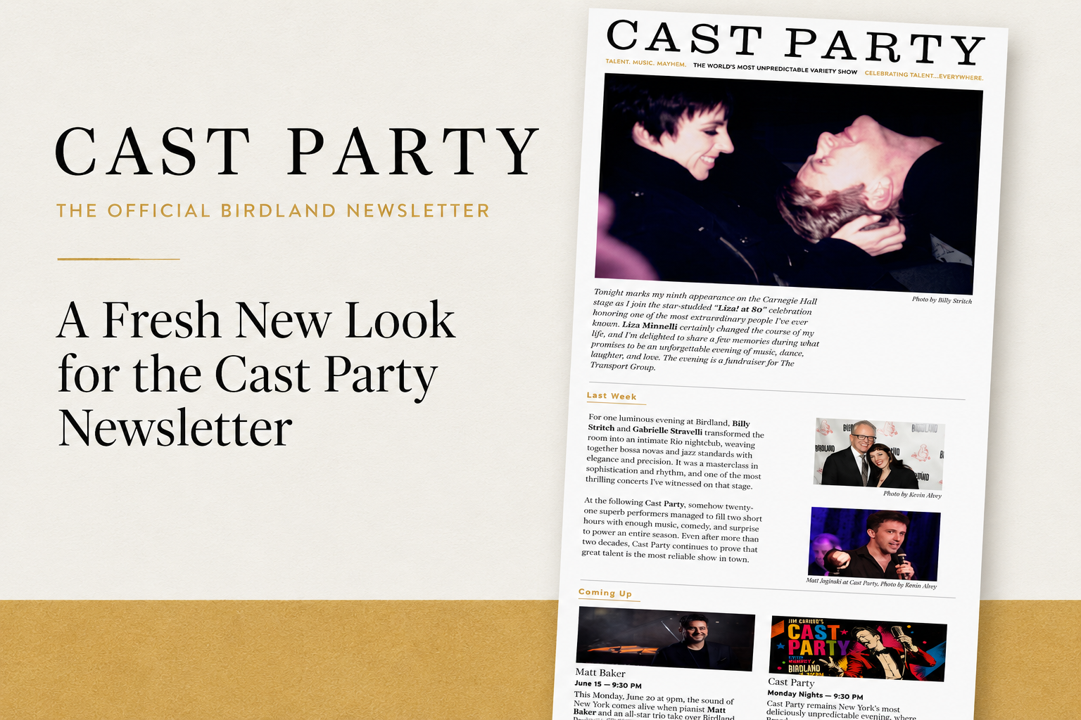
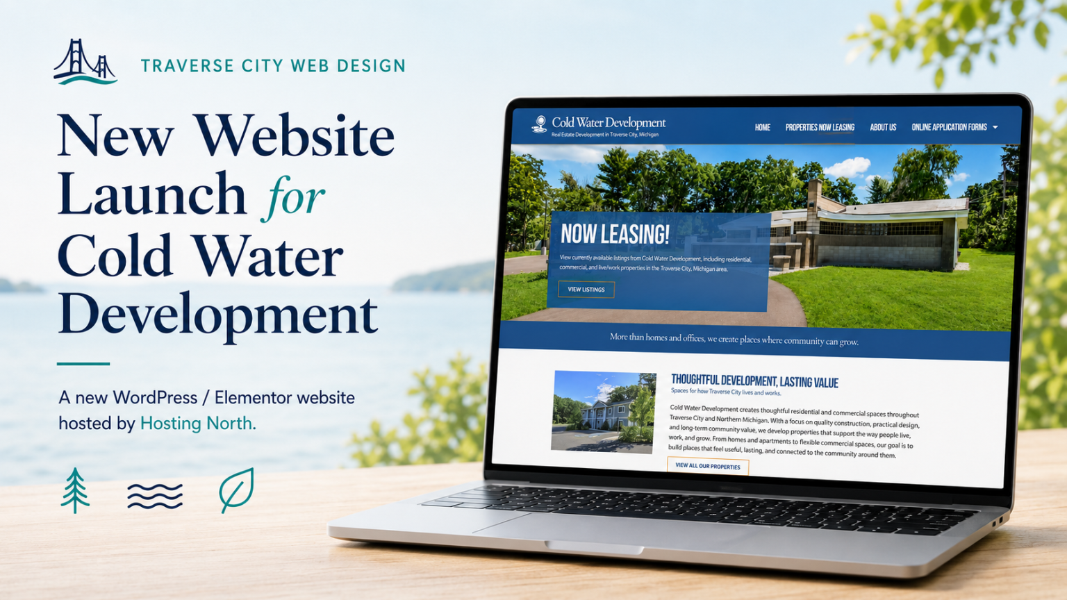
At Traverse City Web Design, most of our work does not begin in Photoshop or static mockups.
It begins live in the browser.
We design directly inside WordPress using Elementor, shaping layouts, spacing, and functionality in real time. This approach allows us to build websites that are not just visually appealing, but also responsive, fast, and practical from the start.
But that does not mean we skip structure.
Before we begin building, we often create visual reference boards like the ones shown here, focused on color systems and typography pairings. These serve as a foundation for the entire design.
A Clear Color System Creates Consistency
The first image outlines a full color palette derived from the Grand Traverse Excavating brand.
Instead of guessing or improvising colors as we go, we define:
- Primary brand colors, like the excavator yellow and deep black
- Supporting neutrals, such as charcoal and light gray
- Expanded web colors, including navy and slate blue for depth and usability
This does a few important things:
- Keeps the design consistent across every page
- Establishes clear visual hierarchy, showing what stands out and what recedes
- Improves usability by ensuring contrast and readability
- Creates a more professional, cohesive feel
It also gives us a shared language with the client. Instead of saying “a darker blue,” we are referencing exact values and intended uses.

Typography Sets the Tone
The second image focuses on font pairing, in this case:
- Roboto for headers, giving the site a strong, clean, modern voice
- Nunito for body text, offering a friendly, readable, approachable feel
Typography decisions matter more than most people realize. They influence:
- How trustworthy a site feels
- How easy it is to read
- How modern or dated the design appears
By defining font weights, hierarchy, and usage early, we avoid inconsistency later. Headers feel intentional. Body text feels comfortable. The entire site reads smoothly.
Why We Often Design Directly in the Browser
Traditional web design often relies heavily on full-page mockups before development begins. At Traverse City Web Design, we often take a browser-first approach because the software we use to build websites is fluid, flexible, and allows us to make design decisions in real time as the site is being developed.
We are a small agency that works primarily with small businesses, and in many cases, our clients are looking for a quick turnaround. They want to get their website live and start generating leads as soon as possible. Because of that, our process is built to be efficient without sacrificing quality.
We also tend to work alone or in very small teams, which means the vision for the website is shared clearly from the beginning. There is less handoff, less fragmentation, and more continuity throughout the project. This allows us to move quickly while still maintaining a cohesive, intentional design.

That said, we always ask our clients how they prefer to approach the design process. Some clients feel more comfortable starting with mockups, while others prefer to see the site come together live. We are happy to work either way and will align our process with what makes the most sense for each project.
Most of the websites we create are not based on out-of-the-box templates or rigid prebuilt layouts. We design with purpose, focusing on calls to action, user flow, and the kinds of visual decisions that help turn visitors into leads. That is a major part of why clients hire us. We have done this many times, and that experience helps us know when it makes sense to move directly into the browser and when it is better to step back and build supporting visuals in tools like Figma or Photoshop, which we also use regularly.
One of the advantages of this process is that clients can see the work taking shape right away. We typically provide the development URL early in the project and invite clients to be as involved in the process as they would like to be. Some prefer to check in occasionally, while others like to follow the site as it evolves. Either way, they are able to see real progress on a living website rather than trying to interpret a static mockup.
The limitation of traditional mockups is that they are static. They may look polished, but they do not always reflect how a website will actually function once it is live.
They do not account for:
- Mobile responsiveness
- Real content variations
- Interactive elements
- Performance considerations
By designing directly in the browser, we solve many of those issues early in the process. Layout decisions can be tested immediately. Content can be shaped in context. Calls to action can be placed where they make the most sense. We can see how the site behaves on different screen sizes as we build, rather than trying to force a static design into a responsive framework later.
At the same time, structured visual reference pieces like color palette boards and typography guides still play an important role. They give us and the client a clear visual foundation, helping guide design decisions while keeping the process intentional and consistent.
The Best of Both Worlds
This approach gives us a strong balance between live design flexibility and clear visual direction.
- Live design flexibility, built directly in WordPress
- Strong visual direction, guided by palettes and typography systems
The result is a website that:
- Looks cohesive and professional
- Feels intentional at every level
- Performs well across devices
- Is easy to expand over time
A Better Way to Build Websites
For businesses, this means fewer surprises, faster timelines, and a final product that feels aligned from top to bottom.
It is not just about making something that looks good.
It is about building something that works, visually, structurally, and strategically.
And it all starts with a clear foundation.