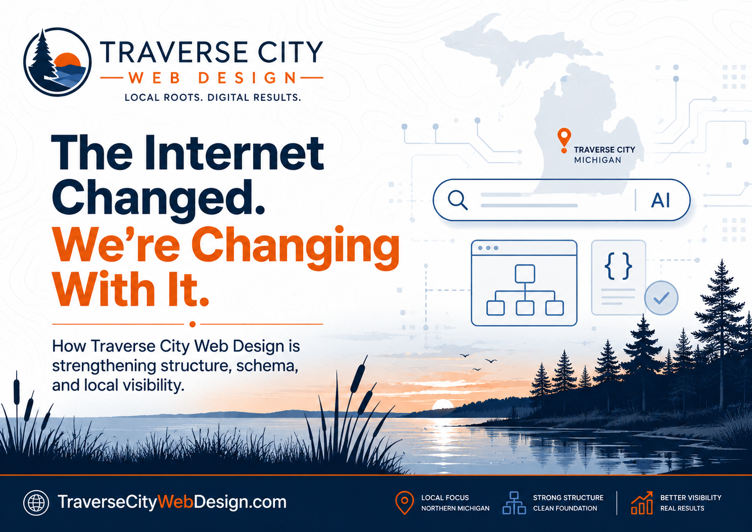
A practical guide to city & municipal websites from Traverse City Web Design
Municipal websites aren’t “marketing sites.” They’re public infrastructure.
For a city, township, village, county, or authority, your website is the front counter, the bulletin board, the forms drawer, the emergency alert system, and the public record shelf — open 24/7, used by everyone, and expected to work without friction.
Residents aren’t browsing for inspiration — they’re trying to pay a bill, find a meeting time, download a form, or get an answer quickly. In many cases, they’re doing it under pressure: during a storm, before a deadline, or while standing at a counter with a phone in hand.
That changes how a municipal website needs to function.
Clarity matters more than cleverness. Speed matters more than style. Organization matters more than design trends. And above all, reliability matters — because when a municipal website fails, it doesn’t just frustrate users, it interrupts access to public services.
In Michigan, expectations around these websites are becoming more clearly defined. The State of Michigan has adopted WCAG 2.1 Level AA as its digital accessibility standard, aligning with the U.S. Department of Justice’s ADA Title II requirements for state and local governments. This isn’t a future goal or a best practice — it’s the current baseline for how public-facing digital systems are expected to perform right now.
That means accessibility is no longer something that can be addressed after launch or treated as a checklist item. It has to be part of how the site is planned, designed, built, and maintained from the beginning.
Accessibility Baseline for Government Websites
Before we talk features, we need to establish the foundation. Accessibility is not a “nice extra” for public entities. It’s a legal obligation, a usability standard, and one of the clearest signals that a municipality is operating with care, professionalism, and respect for its residents.
At its core, accessibility means making sure your website can be used by as many people as possible, including those with visual, auditory, motor, or cognitive disabilities. That includes residents who rely on screen readers, keyboard navigation, voice control software, captions, high-contrast displays, or other assistive technologies. It also includes people dealing with temporary limitations — like a broken arm — or situational challenges, like using a phone in bright sunlight or navigating a site with limited internet access.
In practice, accessibility shows up in simple, concrete ways: text that can be read by screen readers, clear heading structures, sufficient color contrast, captions on videos, forms that can be completed without a mouse, and documents that are properly structured instead of being scanned images. When these elements are in place, the site becomes easier to use for everyone — not just those with disabilities.
For Michigan municipalities, the practical target is WCAG 2.1 Level AA. In real terms, that extends beyond the visible pages of your website. It includes PDFs and downloadable documents, embedded videos and media, online forms, navigation systems, and any third-party tools residents rely on to complete tasks or access information.
If a resident cannot read a document, submit a form, or navigate your site using assistive technology, the system isn’t working as intended. And in a municipal context, “not working” has real consequences.
That’s why accessibility should be treated as the baseline layer of the entire website — not an add-on, not a plugin, and not something addressed after complaints arise. When it’s built in from the start, it improves usability for everyone, reduces long-term risk, and creates a more stable, dependable digital presence for the community you serve.
From that foundation, everything else in this guide builds outward.

1) Design Around Real Resident Tasks
A municipal website should revolve around the tasks residents actually need to complete:
- Pay (taxes, utilities, tickets)
- Apply (permits, licenses)
- Request (service issues, inspections)
- Report (potholes, blight, code concerns)
- Attend (meetings, agendas, minutes)
- Find (ordinances, forms, contact info)
These are not secondary features — they are the primary reason the website exists. Every design decision should support helping residents complete these actions quickly and without confusion.
That starts with prioritization. Not everything can — or should — be treated equally. The most important actions need to be immediately visible, especially on mobile devices where space is limited. This is where “above the fold” thinking becomes critical. The first screen a resident sees should answer the question: “What can I do here right now?”
Clear calls to action play a central role in this. Buttons like “Pay a Bill,” “Apply for a Permit,” or “Report an Issue” should be visually distinct, consistently placed, and easy to tap. They should not be buried in navigation menus or hidden inside long pages.
When done correctly, these calls to action act as shortcuts — reducing friction and guiding users directly to the services they need.
Page structure should reinforce this clarity. Group related tasks together. Use plain, familiar language instead of internal department names. Limit visual clutter so that important actions stand out. A resident should be able to scan a page in a few seconds and immediately understand where to go next.
This approach also improves long-term usability. As new content is added over time, a strong task-based structure prevents the site from becoming disorganized or difficult to navigate. It creates a durable framework that can grow without losing clarity.
Accessibility note:
A clear, predictable structure reduces cognitive load and makes keyboard and screen reader navigation dramatically easier. When content is organized around real tasks with consistent headings, labels, and navigation patterns, it benefits all users — especially those relying on assistive technology.
2) Accessibility Fundamentals ON EVERY PAGE (WCAG 2.1 AA)
Accessibility is not a feature — it’s a system-wide requirement that needs to be present on every page, in every interaction, and across every piece of content. Think of it as the oxygen layer of your website: invisible when it’s working, but critical to everything else functioning properly.
For municipal websites, this means meeting WCAG 2.1 Level AA standards consistently — not just on your homepage, but across internal pages, forms, documents, and tools. These are the foundational elements that ensure your site can be used by all residents, regardless of ability or device.
WCAG 2.1 AA typically includes:
- Proper heading structure (H1, then H2, then H3 in order)
- Text alternatives for meaningful images
- Sufficient color contrast
- Keyboard operability (no mouse required)
- Visible focus states for links and controls
- True form labels (not just placeholder text)
- Error messages that clearly explain what to fix
- Captions for prerecorded video and sensible handling of audio
These elements are not advanced features — they are the baseline for a functioning public website. When they are missing or inconsistently applied, users can quickly become blocked from completing even simple tasks.
It’s also important to understand that accessibility extends beyond your website’s visual design or theme. It includes PDFs, embedded documents, online forms, and any third-party tools residents rely on to complete tasks. If any part of that experience is inaccessible, the system as a whole breaks down.
When accessibility is treated as a consistent, site-wide standard — rather than a one-time fix — it creates a more usable, resilient, and trustworthy website for everyone who depends on it.
3) Fast, Mobile-First Performance
Municipal traffic is heavily mobile. Residents are checking alerts, office hours, meeting times, tax information, forms, and ordinances from their phones — often while on the go, under time pressure, or in less-than-ideal conditions.
That context matters. A municipal website isn’t being viewed on a large desktop monitor in a quiet office. It’s being used in parking lots, at kitchen tables, at job sites, and in moments where speed and clarity are essential. If the site is slow, confusing, or difficult to use on a phone, it immediately creates friction.
This is why performance and mobile-first design need to be treated as core requirements, not technical afterthoughts. The site should be designed for small screens first, then scaled up — not the other way around.
Every municipal site should prioritize:
- Lightweight pages (optimized images, compressed assets, and minimal scripts)
- Fast loading over cellular data, not just high-speed Wi-Fi
- Clean layouts that adapt well to small screens
- Touch-friendly buttons and navigation (large tap targets, clear spacing)
- Avoiding oversized background videos and bloated sliders
- Reducing unnecessary animations or visual effects that slow down rendering
Speed is not just about convenience — it directly impacts whether a resident can complete a task. If a page takes too long to load, users will abandon it. If navigation lags or buttons are hard to tap, frustration builds quickly. In a municipal context, that can mean missed payments, incomplete forms, or residents giving up entirely.
Performance also plays a role in long-term maintainability. Lighter, faster websites are easier to manage, more stable across updates, and less likely to break under heavy traffic or during peak usage periods.
Accessibility note: Performance is an accessibility issue. Slow websites disproportionately affect users on older devices, limited bandwidth connections, or assistive technologies. A fast, efficient site reduces barriers and ensures that more residents can access information and complete tasks without unnecessary delays.
4) A Real Public Meetings System (Agendas, Minutes, Packets, Livestreams)
This is one of the most important sections of any municipal website. It’s where transparency happens in real time — and where residents go to understand how decisions are being made. When meeting information is easy to find and consistently organized, it builds trust. When it’s scattered, outdated, or hard to access, that trust erodes quickly.
A strong public meetings system should feel predictable. Residents should know exactly where to go, what they’ll find, and how current the information is — without having to dig through multiple pages or guess which document is the latest version.
At minimum, include:
- Upcoming meetings with clear date, time, and location (including virtual access details if applicable)
- Agendas posted with reasonable lead time before the meeting
- Minutes posted promptly after approval
- Packets and supporting documents clearly organized by meeting date
- Livestream links and recordings when applicable
Organization matters just as much as availability. Group documents by meeting, label them clearly, and maintain a consistent format over time. A resident looking at a meeting from six months ago should have the same experience as someone viewing a meeting next week.
Accessibility note: Meeting content must be accessible to all residents. PDFs should be properly structured so they can be read by screen readers and navigated efficiently. That means using real text (not scanned images), applying heading structures within the document, tagging content correctly, and ensuring a logical reading order. Tables should be built with proper headers, and any images should include alternative text where needed.
When creating PDFs, avoid exporting “print-only” documents or uploading scans of paper copies. Instead, generate PDFs directly from source files (Word, Google Docs, or similar) with accessibility features enabled. Use built-in heading styles, provide descriptive link text, and run accessibility checks before publishing. If possible, also provide key information as HTML on the webpage itself, since HTML content is typically more accessible and easier to navigate.
For video content, provide captions for livestreams and recorded meetings whenever possible. Captions not only support users who are deaf or hard of hearing, but also improve usability for anyone watching without sound or in a noisy environment.
When meeting materials are accessible, organized, and consistently maintained, they become a reliable public record — not just a collection of files. That reliability is a cornerstone of transparency and public trust.
5) Forms That Work (And Don’t Trap People)
Municipal websites run on forms. FOIA requests, permit applications, service requests, registrations — these are some of the most common and important interactions residents have with their local government online.
When forms are clear and easy to use, they streamline communication and reduce staff workload. When they’re confusing, broken, or inaccessible, they create friction, increase support calls, and can prevent residents from completing essential tasks altogether.
Strong municipal form workflows include:
- Simple online forms when possible (not just “print a PDF”)
- Clear instructions and field descriptions
- Logical grouping of fields to match how people think through the task
- Clear confirmation messages and next steps after submission
- Save-and-continue functionality for longer applications when feasible
- Spam protection that doesn’t block screen readers or keyboard users
Good form design is about reducing uncertainty. A resident should always know what information is being asked for, why it’s needed, and what will happen after they submit it.
Accessibility note: Forms are one of the most common WCAG failure points — especially around labeling, focus order, error handling, and timeouts. Every form field should have a properly associated label (not just placeholder text inside the field). Labels ensure that screen readers can correctly announce what each field is for, and they remain visible even after a user begins typing.
In addition, forms should follow a logical tab order for keyboard navigation, provide clear and specific error messages (for example, “Please enter a valid email address” instead of a generic error), and avoid time limits that could interrupt users who need more time to complete the form.
When forms are properly labeled, structured, and tested across devices and assistive technologies, they become reliable tools — not barriers. That reliability improves completion rates, reduces frustration, and ensures that all residents can access the services they need.
6) A “How Do I…?” Hub (Your Most Powerful Page)
This is one of the highest-impact pages a municipal website can have. A well-designed “How do I…?” hub acts as a shortcut layer for the entire site — translating government structure into real-world tasks that residents actually think in.
Most residents don’t know — or care — which department handles a service. They’re not looking for “Department of Public Works” or “Clerk’s Office.” They’re thinking: “How do I pay my water bill?” “How do I get a permit?” “How do I report a problem?”
This page bridges that gap. It removes the need to understand internal organization and instead presents the site in a way that matches how people naturally search for help.
A strong “How do I…?” page should:
- List the most common resident tasks in plain, conversational language
- Link directly to the action page (not a general department page)
- Group tasks into clear categories (Payments, Permits, Services, Meetings, etc.)
- Be easy to scan — short phrases, not long descriptions
- Work cleanly on mobile with large tap targets and simple layouts
- Be accessible directly from the main navigation
- Be reviewed and updated quarterly based on real resident questions and staff feedback
Design matters here. This page should feel fast, clean, and intuitive. Avoid clutter, large blocks of text, or complex layouts. Think of it as a control panel — a place where residents can quickly find what they need and move on.
Prioritization is key. The most common tasks should appear at the top, especially for mobile users. If your office regularly receives calls about specific issues, those items should be surfaced prominently on this page. Over time, this page can significantly reduce call volume and walk-in interruptions.
It’s also important to think of this page as a living system, not a one-time build. As services change, seasonal needs arise, or new questions come in, the “How do I…?” hub should evolve. It becomes a reflection of how residents actually interact with your municipality.
Accessibility note: Plain language is accessibility. When tasks are labeled clearly — “Pay a Bill” instead of “Utility Billing Services” — users can find what they need faster. This reduces cognitive load, improves screen reader navigation, and ensures the site does not require insider knowledge to use effectively.
7) Search That Understands Municipal Reality (Ordinances, Minutes, Documents)
Residents don’t browse municipal websites the way they browse retail or marketing sites. They hunt. They are looking for something specific — a zoning rule, a permit PDF, an ordinance, meeting minutes about a particular issue, or a policy from years ago — and they want to find it quickly.
This is where search becomes one of the most important tools on the entire site.
In practice, many residents will skip navigation entirely and go straight to the search bar. We see this consistently across municipal websites we build — when search is placed clearly and prominently (often in the header or near the top of the homepage), it becomes one of the most heavily used features on the site.
That behavior should shape how search is designed. It shouldn’t be hidden or treated as a secondary feature. It should be easy to find, fast to use, and reliable in the results it returns.
Your search should be:
- Sitewide and fast, returning results across all pages and content types
- Capable of indexing and surfacing PDFs, meeting minutes, agendas, and document libraries
- Smart enough to prioritize high-value civic content over outdated or low-relevance pages
- Tolerant of imperfect searches (handling partial terms, misspellings, or common phrasing)
- Clearly structured, with readable titles and context so users know what they’re clicking
Search is also critical for long-term content growth. As your website accumulates years of documents, ordinances, and records, navigation alone cannot keep everything easily accessible. A strong search system becomes the connective tissue that allows residents to access both current and historical information without friction.
It’s worth thinking about search as a primary navigation tool — not a backup. For many users, it is the fastest path to completing their task.
Accessibility note: Search results must be fully keyboard navigable and readable by screen readers, and the documents themselves must be accessible once opened. A perfect search result that leads to an unreadable PDF is still a failure.
8) Alerts & Emergency Communication (When It Actually Matters)
When something urgent happens — road closures, water service disruptions, boil water advisories, severe weather, or public safety issues — your website becomes a critical communication tool. In those moments, residents are not exploring. They are looking for clear, immediate answers.
This is why alert systems need to be treated as a core part of the website’s structure, not an afterthought. The homepage, in particular, should be able to shift into “alert mode” when needed — prioritizing urgent information at the very top of the page so it cannot be missed.
Social media can support communication, but it is not a substitute for a reliable, centralized alert system. Posts can be missed, feeds are unpredictable, and not all residents use those platforms. Your website should serve as the official source of truth — the place residents know they can go for accurate, up-to-date information.
Best practice includes:
- A dedicated Alerts or Notices area that is always easy to find
- Homepage alert banners for urgent or time-sensitive situations
- Time-stamped updates with clear status changes (e.g., “Issued,” “Updated,” “Resolved”)
- Clear, plain-language descriptions of what is happening and what residents should do
- Optional integration with email or text alerts for direct notifications
- Redundant communication channels, with the website as the central, authoritative source
Clarity is essential. Residents should be able to understand the situation within seconds — what’s happening, who is affected, what actions they need to take, and when the issue is expected to be resolved. Avoid vague language or buried updates.
It’s also important to maintain a visible history of alerts, especially for ongoing situations. This helps residents track changes over time and reduces confusion when information evolves.
Accessibility note: Alerts must be readable, high-contrast, and not communicated by color alone. Avoid images that contain critical text, especially for time-sensitive notices. All alert content should be accessible to screen readers and easy to navigate using a keyboard.
9) Clear Contact Paths and Service Accountability
Residents shouldn’t have to guess who handles an issue, what happens after they submit a request, or whether anyone will respond. When contact paths are unclear, frustration builds quickly — and staff often end up fielding calls that could have been avoided with better structure.
A strong municipal website makes it obvious how to get help. It creates clear, reliable pathways for communication and sets expectations for what happens next.
Every municipal website should clearly show:
- Department contact information (phone, email, and physical location)
- Office hours and holiday closures that are kept up to date
- Clear “Report an Issue” or “Request Service” pathways
- Response-time expectations where appropriate
Visibility is just as important as accuracy. Contact information should not be buried on a single page. Ideally, key contact details — such as a primary phone number or general contact email — should be accessible from every page, often in the header or footer. Residents should never feel stuck without a clear next step.
One effective approach is to treat your website’s contact system the same way a front desk or receptionist works. Instead of forcing residents to choose the correct department upfront, provide a single, clearly labeled contact point — such as a general email address or contact form for the entire site. From there, staff can triage and route inquiries internally.
This model reduces confusion, improves response consistency, and ensures that requests don’t get lost because a resident selected the wrong department. It also creates a more welcoming experience — residents don’t need insider knowledge of how the municipality is organized to get help.
Behind the scenes, this approach can be supported by internal workflows that direct messages to the appropriate staff member or department. Over time, it also provides insight into the types of requests residents are making most often, which can inform future improvements to the website.
Clear contact paths are ultimately about accountability. When residents know how to reach you — and what to expect after they do — it builds confidence in the system as a whole.
Accessibility note: Phone-only or email-only contact methods can exclude residents. Multiple accessible options matter, especially for people with hearing, vision, or mobility challenges. Providing a combination of phone, email, and accessible online forms ensures that more residents can successfully reach your municipality.
10) A Governance and Maintenance Plan (Because “Launch” Isn’t the End)
The most common failure mode for municipal websites isn’t bad design — it’s neglect.
A site can launch with strong structure, clear content, and solid accessibility, but without an ongoing plan, it will slowly degrade. Documents pile up, outdated information lingers, accessibility gaps reappear, and over time the site becomes harder to use and less trustworthy. This isn’t a technical failure — it’s a process failure.
A sustainable municipal website requires clear ownership and defined workflows. That means knowing who is responsible for updates, backups, and ongoing maintenance; how meetings, agendas, and minutes are consistently posted and archived; how documents are named, categorized, and eventually retired; and how accessibility is monitored over time through both automated scans and real-world human review. Just as important, there needs to be a process for reviewing and removing outdated content so the site doesn’t become cluttered or misleading.
Accessibility, in particular, is not a one-time checkbox. It’s an ongoing publishing discipline. Every new document, form, page, or update has the potential to either maintain or break accessibility standards. Without staff awareness and a repeatable process, even a fully compliant site can drift out of compliance within months.
A Practical Michigan-Focused Accessibility Workflow
For Michigan municipalities planning a redesign — or working to bring an existing site into alignment — the most effective approach is to treat accessibility as a structured, ongoing workflow rather than a one-time project. Start by identifying the most-used pages and document libraries, such as forms, agendas, minutes, and ordinances, since these have the highest impact on residents. From there, conduct a combined audit using automated tools and hands-on testing, including keyboard navigation, color contrast checks, and real form usage.
Once issues are identified, focus on fixing global templates and core design elements first so improvements apply across the entire site. Then move into document remediation, prioritizing high-use materials like forms and meeting documents. At the same time, staff training becomes critical — ensuring that anyone responsible for uploading content understands basic accessibility practices and follows consistent standards.
Finally, establish a regular review cycle, typically quarterly, to revisit key areas of the site, check for regressions, and update content as needed. This approach transforms accessibility from a reactive, high-effort project into a manageable part of routine website maintenance — creating a system that stays reliable, usable, and compliant over time.
Where Traverse City Web Design Fits In
Municipal websites carry real responsibility. They are not marketing tools or optional add-ons — they are systems people depend on every day to access services, understand local government, and stay informed. When they are built well, they reduce friction, improve communication, and strengthen trust. When they are not, the impact is immediate: missed information, increased staff workload, and frustrated residents.
At Traverse City Web Design, we approach municipal websites as public infrastructure. That means clear task-based navigation, durable page structures that hold up over time, fast mobile-first performance, and accessibility built in from the beginning — not layered on later. Every decision is grounded in how residents actually use these sites, especially in real-world situations where time, clarity, and reliability matter.
For Michigan cities, townships, villages, counties, and public authorities, the path forward doesn’t have to be overwhelming. The most effective starting point is a practical audit paired with a prioritized roadmap — identifying what matters most, what needs to be fixed first, and how to build a system that stays organized and accessible over time. From there, the goal is simple: create a website that works for every resident, every day, without friction.
That work doesn’t stop at launch. Long-term performance, security, and reliability depend on how the site is hosted and maintained. Through Hosting North, we provide fully managed, environmentally responsible website hosting designed specifically for the types of sites we build. Our infrastructure uses energy-efficient systems and offsets 300% of its energy usage through renewable energy credits — supporting a cleaner energy grid while delivering stable, high-performance hosting.
Hosting North is designed to be quiet and dependable — updates handled, backups managed, security monitored, and performance continuously maintained in the background. For municipalities, that means fewer technical concerns, more predictable operations, and a website that remains fast, secure, and accessible over time.
If you’re planning a redesign, evaluating your current site, or preparing for accessibility compliance, we’re here to help you take the next step with clarity. The right approach isn’t about adding more complexity — it’s about building a system that works, holds up, and serves your community well into the future.